The thumbnail idea library
One clear idea.
Twelve ways to show it.
Choose a thumbnail layout that matches the video: a real transformation, a product comparison, a finished result or a specific question. Then adapt the example brief to your own footage and audience.
Good YouTube thumbnail ideas start with the promise of the actual video. Pick one recognizable subject and a layout that makes that promise clear at a small size. The examples below include suggested titles, composition decisions, cautions and copy-ready prompts.
About these examples: the twelve visuals are original illustrated layout sketches created for Thumb Maker. The titles describe hypothetical videos. They are not Pikzels-generated samples, completed product tests or evidence of higher CTR.
Affiliate disclosure: Thumb Maker is an independent affiliate publisher, not Pikzels. The marked links to Pikzels may earn a commission. A referral does not guarantee a discount.
Three supplied thumbnails, three composition lessons
See how a split comparison, a practical warning and a single focal detail appear in full thumbnail artwork. These owner-supplied images carry Pikzels branding; Thumb Maker did not generate or product-test them. They are composition references, not evidence of click-through-rate results.
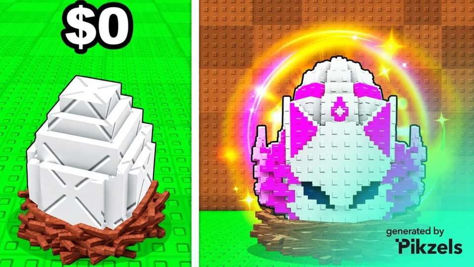
Gaming: make the contrast immediate
The split frame compares a plain egg with a glowing, detailed version. The large shared shape makes the visual change easy to locate.
Apply the idea to your own video
Borrow the split and consistent subject placement. Keep price, reward and progression claims tied to what the video actually shows.
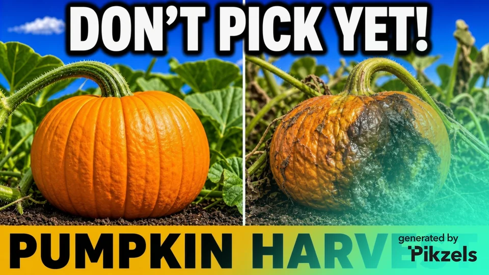
Tutorials: show the decision
The two pumpkins show a clear difference in condition. The short warning introduces a practical choice rather than repeating a full video title.
Apply the idea to your own video
Borrow the visible comparison. Use a warning only when the video explains and supports it; preview the large text at a small size.
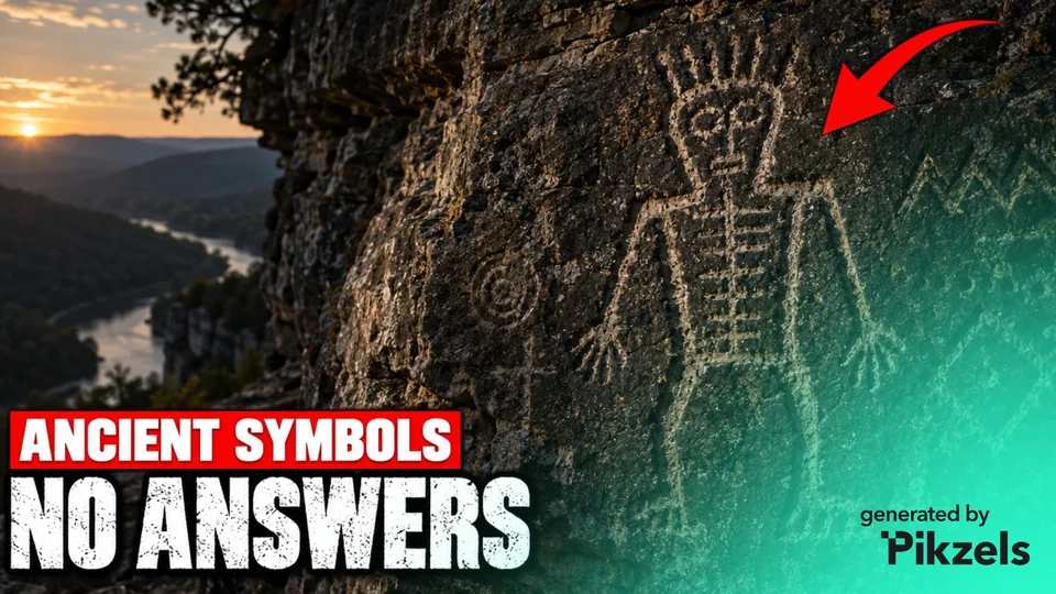
Discovery: point to one detail
The red arrow directs attention to a small area of the rock. The landscape supplies context while the short headline frames a question.
Apply the idea to your own video
Borrow the focal-detail layout. Point to a relevant, visible feature and avoid presenting an illustration as evidence of a real discovery.
The reuse invitation for Thumb Maker’s original sketches below does not extend to these supplied images. Preserve the distinction between a visual concept and a verified event or result.
Affiliate link: Thumb Maker may earn a commission if you subscribe through the marked link. It opens Pikzels; the referral does not guarantee a discount.
12 YouTube thumbnail ideas with examples
Start with the video type below, or browse every layout. The sketches show composition; replace their illustrative objects with your own accurate photos, screenshots or permitted artwork.
Showing all 12 layouts.
The hero object
Example video title: The Tiny Microphone I Actually Use
Use it for: A product review with one item worth examining.
The layout decision: Give the item most of the frame. Let the video title explain the verdict instead of surrounding it with five badges.
Watch out: Do not invent ports, buttons or packaging. Use a real product photo when exact details matter.
Prompt: the hero object
Before and after
Example video title: I Fixed My Messy Desk With One Change
Use it for: A transformation that the actual video documents.
The layout decision: Keep the viewpoint and scale consistent across both halves. The changed thing should be obvious without reading a paragraph.
Watch out: Do not show a fictional result as evidence of a real transformation.
Prompt: before and after
Head-to-head comparison
Example video title: Controller A vs Controller B: Which Fits Small Hands?
Use it for: A video comparing two clearly defined alternatives.
The layout decision: Give both options equal visual weight. Add one shared comparison question rather than two competing headlines.
Watch out: Avoid a winner badge unless the video actually supports that conclusion.
Prompt: head-to-head comparison
Show the finished result
Example video title: Build This One-Page Portfolio
Use it for: A tutorial where viewers want a specific finished thing.
The layout decision: Lead with the output, not a tiny view of every menu used to make it. One short label can identify the lesson.
Watch out: If an interface needs to be accurate, use your actual screenshot and keep the exact text in an editor.
Prompt: show the finished result
The problem close-up
Example video title: Why This Cable Keeps Disconnecting
Use it for: Troubleshooting with a visible fault or detail.
The layout decision: Crop tightly enough that the issue is recognizable. Use a single pointer to help locate a real detail.
Watch out: A red arrow cannot rescue a detail that is too small or an image that shows the wrong problem.
Prompt: the problem close-up
Three options, one question
Example video title: Which Starter Kit Would I Buy?
Use it for: A short list where the differences between three choices matter.
The layout decision: Use three large, separated items with one common question. The title can carry the full model names.
Watch out: Do not turn a three-item comparison into a crowded catalog of ten products.
Prompt: three options, one question
One meaningful number
Example video title: What Fits on a 64 GB Memory Card?
Use it for: An explainer centered on one capacity, budget or constraint.
The layout decision: Make the number and its unit inseparable. Use a recognizable object to show what the number refers to.
Watch out: An earnings figure, percentage or result needs evidence. A large number is not evidence by itself.
Prompt: one meaningful number
A three-step path
Example video title: From Rough Sketch to Finished Icon
Use it for: A process with three distinct stages the viewer can understand.
The layout decision: Use one left-to-right progression. The stages should look different rather than becoming three dense screenshots.
Watch out: Keep detailed instructions in the video; the thumbnail only needs to communicate the progression.
Prompt: a three-step path
Assumption vs reality
Example video title: More Tabs Does Not Mean More Progress
Use it for: A lesson that contrasts an assumption with a documented explanation.
The layout decision: Use two deliberately different scenes and clear labels. Save the reasoning and exceptions for the video.
Watch out: Do not label a disputed claim a myth without evidence. This example is a creative premise, not a measured productivity result.
Prompt: assumption vs reality
The in-game decision
Example video title: Which Door Would You Pick?
Use it for: A gaming video built around one real choice or challenge.
The layout decision: Make the choice visible immediately: two doors, two routes or two items. Use your own footage when the actual game matters.
Watch out: Do not invent rewards, game features or a challenge outcome that the video does not contain.
Prompt: the in-game decision
A repeatable series frame
Example video title: One Design Fix: The Busy Thumbnail
Use it for: An ongoing series that needs recognition across episodes.
The layout decision: Keep the frame, typography and accent position consistent. Change the central subject and specific episode question.
Watch out: Do not let a giant episode number take space away from the actual topic.
Prompt: a repeatable series frame
From idea to a usable brief
Choose the concept. Then choose the tool.
Copy a layout brief, replace the bracketed details and check that the title and artwork describe the same video. For a more detailed brief, the free prompt builder adds your subject, layout and text preferences.
Considering Pikzels? Its official Edit page describes changes made with written instructions and optional selection masks. These planning briefs are a starting point to adapt; exact layout, text and object accuracy still need checking. Compare workflows in the AI thumbnail generator guide and read the Pikzels pricing guide before choosing a plan.
Affiliate link below: opens Pikzels. Thumb Maker may earn a commission; this is an independent publisher recommendation.
How to choose a thumbnail idea for your video
Start with what the viewer will actually get. A repair calls for a visible problem or real result. A buying decision needs a fair comparison. An explainer needs an object, contrast or detail that represents the topic. Select the layout after naming that promise.
Make the title and image do different jobs. A title can state the precise topic while the picture shows the comparison or subject. Repeating every word in both places uses valuable space. For example, a title can name two controllers while the image makes their size difference visible.
Reduce before decorating. Inspect the sketch at 160px, then test the actual exported image with the thumbnail checker and preview. The small-sketch switch above is a composition aid, not an exact simulation of every YouTube display or a performance prediction.
Frequently asked questions about thumbnail ideas
What makes a good YouTube thumbnail idea?
A clear connection between the image, the title and the real video. YouTube’s thumbnail and title guidance recommends readable text, avoiding an overly complex design and reviewing results with the intended audience in mind. No single layout guarantees clicks.
Do faceless YouTube thumbnails need a person?
A thumbnail can communicate through a product, a visible result, a comparison or a close-up detail. The faceless filter above collects layouts that do not require a presenter’s face. Keep the subject specific to the video instead of filling the empty space with unrelated symbols.
How much text should a thumbnail have?
Use only the text that helps the viewer understand the picture. The short labels in these sketches are editorial examples, not a universal word-count rule. Inspect the actual export at small sizes; move detail to the video title if the image becomes crowded.
Can these prompts be used in Pikzels?
They are plain-language creative briefs to adapt to the chosen workflow. Pikzels describes prompt-based image editing; that does not mean these illustrations were generated in Pikzels or that a particular output has been tested. Exact brand details, interface text and factual imagery may need your own source assets and manual editing.
Can these examples be reused?
The original layout sketches and brief text on this page may be adapted for your own video planning. If you cite this library in a tutorial or resource list, link to this page so readers can access the explanations and prompts. This invitation does not grant rights to another person’s photos, branding or artwork.
Sources and editorial method
Published 5 November 2026. The twelve sketches, hypothetical titles and prompts are original editorial examples. General design guidance was checked against YouTube’s thumbnail and title tips; the Pikzels workflow description was checked against its official Edit page on 5 November 2026. No provider generation, audience test, CTR improvement or comparative output-quality test was performed for this article. Read the editorial standards.
Shortlist up to three concepts
Select layouts using the checkbox on each card. A useful test compares a meaningful creative difference, not just a new background color. The shortlist is local to this tab.
No concepts selected.
by
Tags: